This final research project at my undergraduate focused on the development of a customized typographic font, for use and applications within the sport, so the institution targeted for the use of this project was Londrina Esporte Clube, which has a consolidated and developed visual identity, but in need of complementing it with the use of customized typography to improve some visual aspects of the institutional brand, such as the use of typography in sports materials and brand enhancement in the various media.

Each sports club must not only achieve goals in games but also financially for generation and revenue and equity since this is one of the main incomes of a club from the sale of shirts. Therefore, in a survey by the Gazeta do Povo newspaper carried out in 2015, it was pointed out that the LEC has a significant increase in the shirt sales sector in Paraná, around 33.5%, so there is a need for constancy in the visual improvement of their uniforms for that the sales sector can continue to grow.
Develop typography that represents the passion of the fans of the club and that conveys the identity of the people of the city of Londrina, and if the typography makes any sense, it is visual and historical, it is an art. It is a craft by which the meanings of a text can be clarified, honored, and shared or consciously disguised.
In a world full of messages that no one asked to receive, typography often needs to draw attention to itself before it can be read. In order for it to be read, it must, however, give up the same attention that it aroused.
It is the process of elaborating and implementing production activity, price formation, promotion, and distribution of a sports product to satisfy the needs or desires of consumers and to achieve the company's objectives.


Typography plays a central role in the design. Most pieces of graphic communication require, to a greater or lesser extent, the use of the written word to fulfill its function, and typography to systematize writing, typography, like many other crafts, requires sufficient training and great attention to detail.

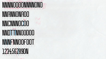
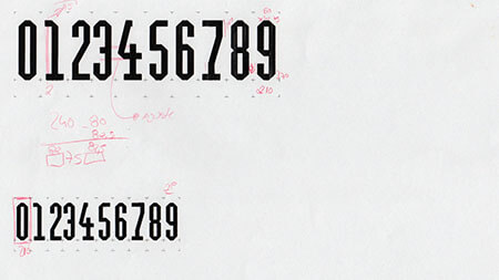
The main reference in the construction of typography was the use of a grid of polyhedra that has the shape of the sidewalks of the main artistic and central points of the city of Londrina, that has in its form that provides strength and tradition in its construction, as well as a cultural symbol.


